al.
al.
Molzym
overview
(project details)
Coordinator
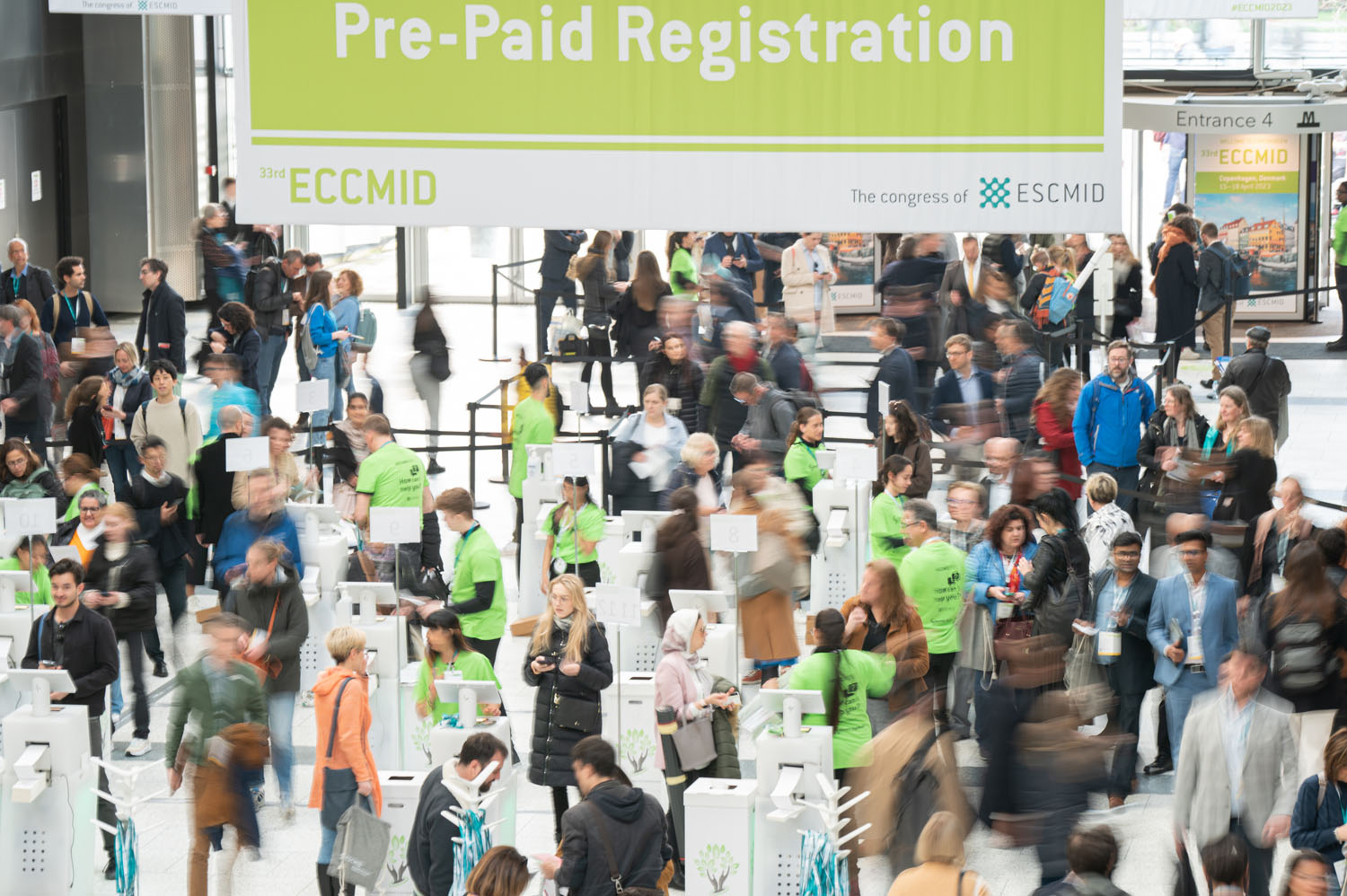
Molzym makes molecular diagnostic tools used in labs across 40+ countries. The science was solid, the reputation was strong, the visual identity was stuck somewhere in the early 2000s. I led the full rebrand: positioning, logo, brand system, messaging, and a complete marketing toolkit, then rolled everything out across 15+ international congresses. The kind of project where you touch every single piece of communication the company puts out.
the challenge
Molzym had built a strong reputation in the lab. The technology was cutting-edge. The brand was not.
That gap shows up everywhere when you start looking. A logo that hadn't changed in 20 years. Marketing materials that looked different depending on who made them last. A sales team and a distribution network across 40+ countries, all representing the same company with slightly different versions of it. Not because anyone was doing it wrong, but because there was no system holding it together.
The job was to build that system. Modernise the brand, create a visual and verbal identity strong enough to work across languages, cultures, and very different sales contexts, and give every person selling Molzym's products the tools to do it with confidence.
the approach
I treated this rebrand not just as a design update, but as a complete commercial alignment.
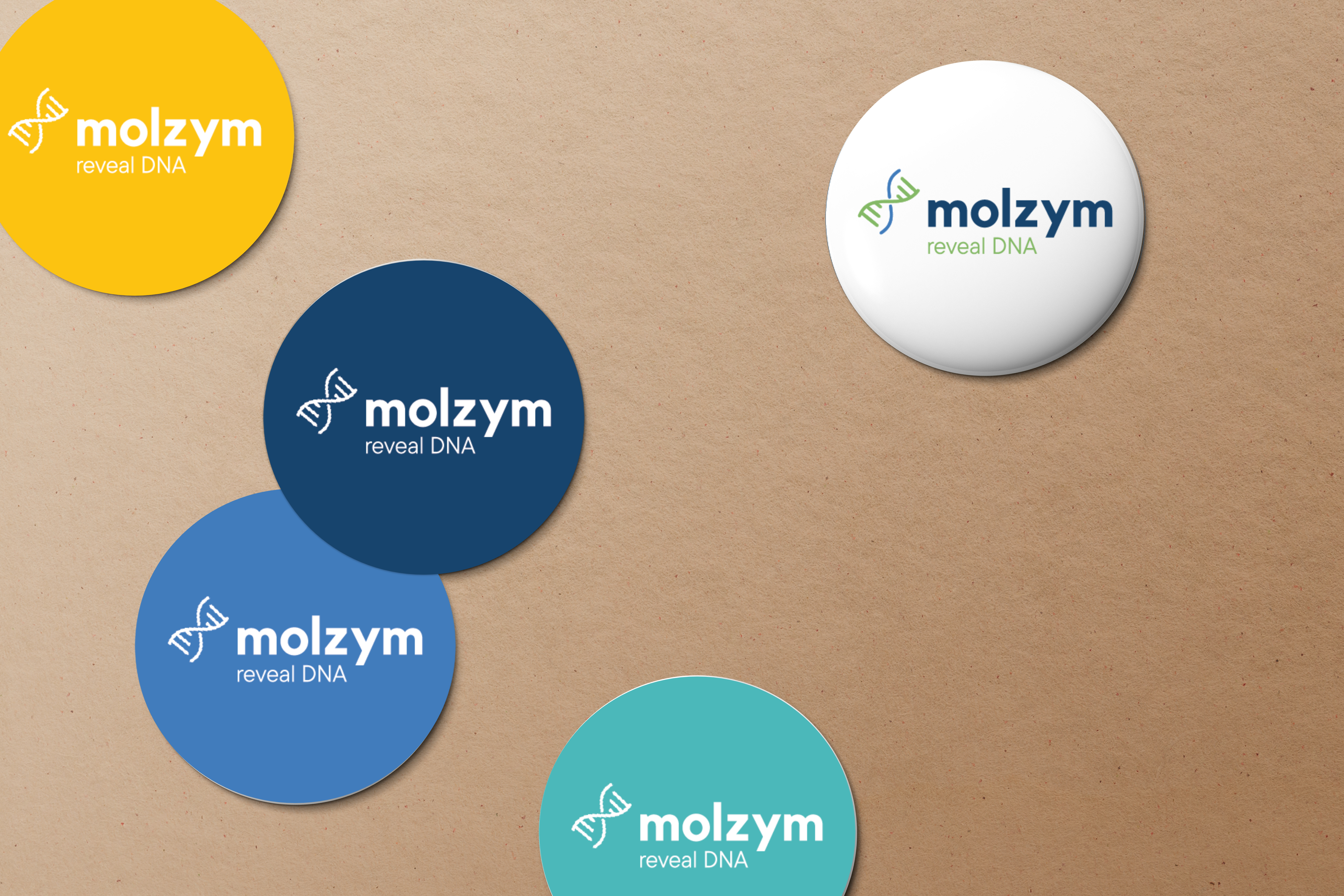
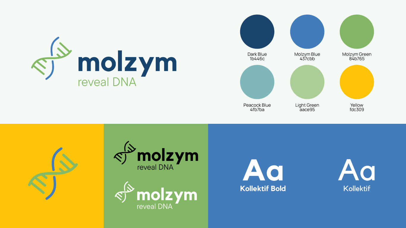
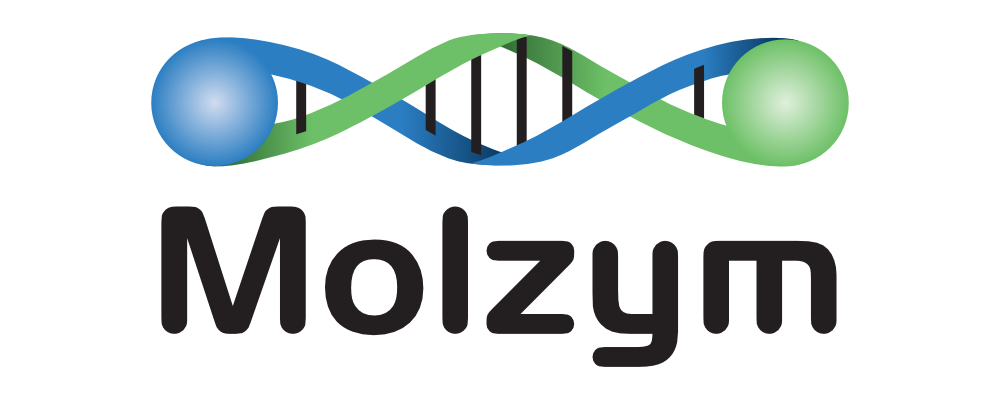
Logo Redesign
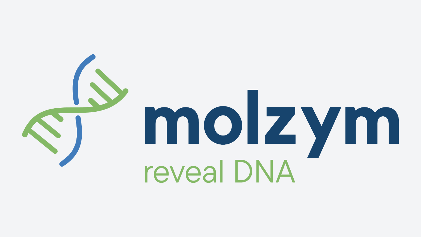
The old logo had 20 years of history behind it, and people recognised it across the industry. The job wasn't to erase that. It was to keep what worked and sharpen the rest: a cleaner mark, more versatile, with the precision you'd expect from a company that makes diagnostic tools for clinical labs worldwide.
Visual System
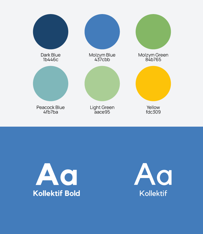
Scientific brands tend to look cold on purpose, as if clinical credibility requires clinical design. I pushed back on that. The new colour palette and typefaces bring technical authority without losing warmth. Every font choice was driven by one constraint: dense scientific data has to stay readable, on screen, in print, and on a stand at ESCMID.
Brand Guidelines
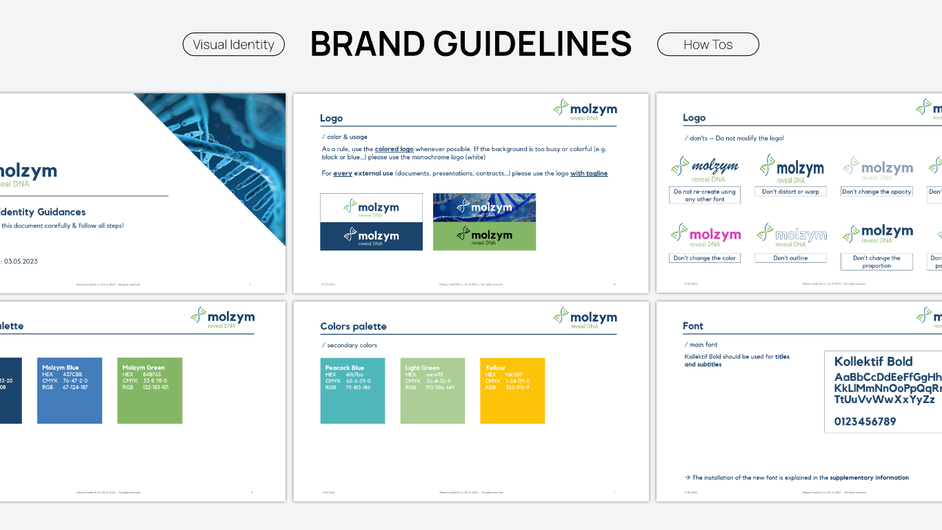
A new identity is only as strong as the people using it. The brand guidelines became the single reference for the entire organisation: visual rules, messaging frameworks, tone of voice. Whether an asset was being produced internally in Bremen or by a distributor in Southeast Asia, the result had to look and sound like the same company.
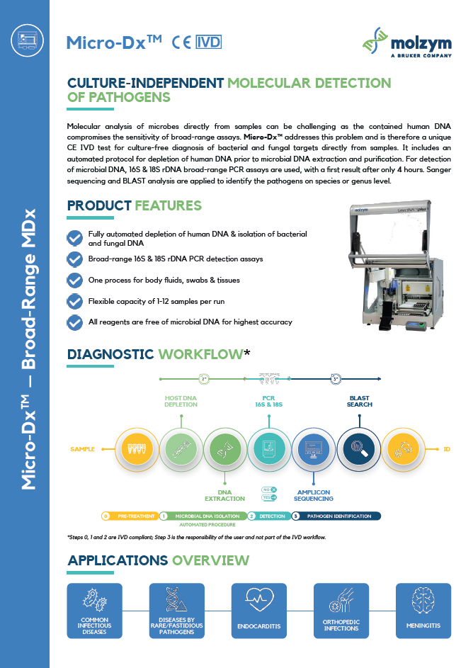
Marketing Toolkit
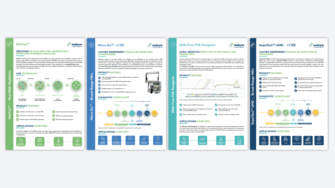
Guidelines tell you the rules. The toolkit gives you the files. I built a ready-to-use set of materials for the commercial and scientific teams: presentation decks, corporate brochures, product data sheets, congress collateral. Everything a salesperson or distributor needs to walk into a room and represent Molzym without guessing. (Details below).
logo redesign
The original logo had been there for 20 years. People in the industry knew it, and that recognition mattered. But it didn't work well anymore on the formats that matter now: screens, social, congress signage, small-scale print.
The goal was evolution, not reinvention. Keep what people recognised, lose what was holding it back. A cleaner mark, paired with sharper typography, built to hold up whether it sits on a 3mm data sheet footnote or a full-scale exhibition wall.
The result is a logo that feels like the company Molzym actually is today, not the one it was when the original was designed.
the results
(impact & metrics)
Organically, I grew the company's LinkedIn following by over 40% in a highly niche market. More importantly, the new content strategy generated around 20 qualified B2B leads per month, successfully connecting marketing efforts directly to sales outcomes.
Follower Growth
Generated Monthly
toolkit
(full marketing rollout)
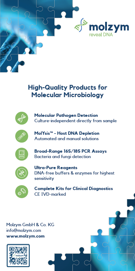
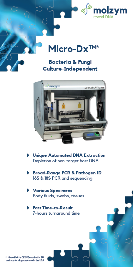
Corporate Brochure
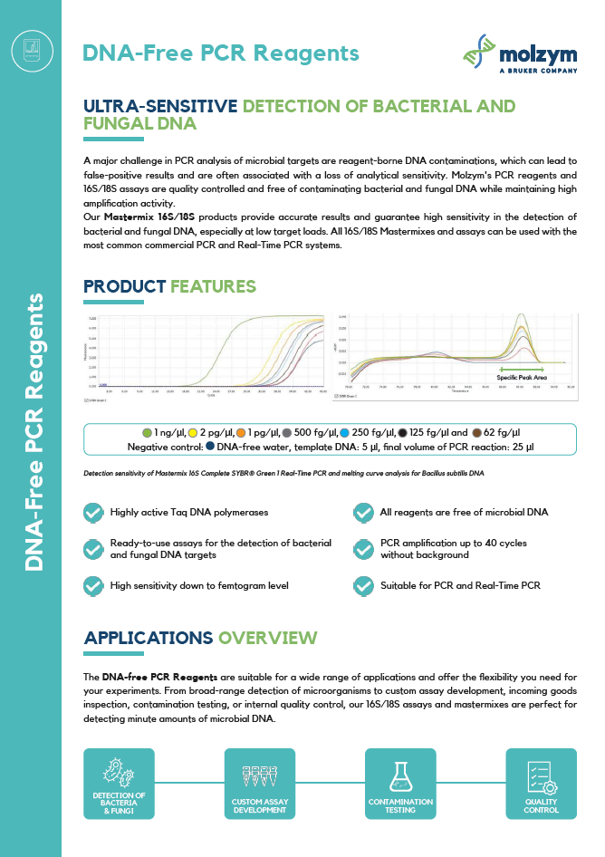
.png)
.png)
.png)
.png)
.png)
PPT Master Slide
Email Signature
Please find enclosed our newly updated product documentation.
Best regards,
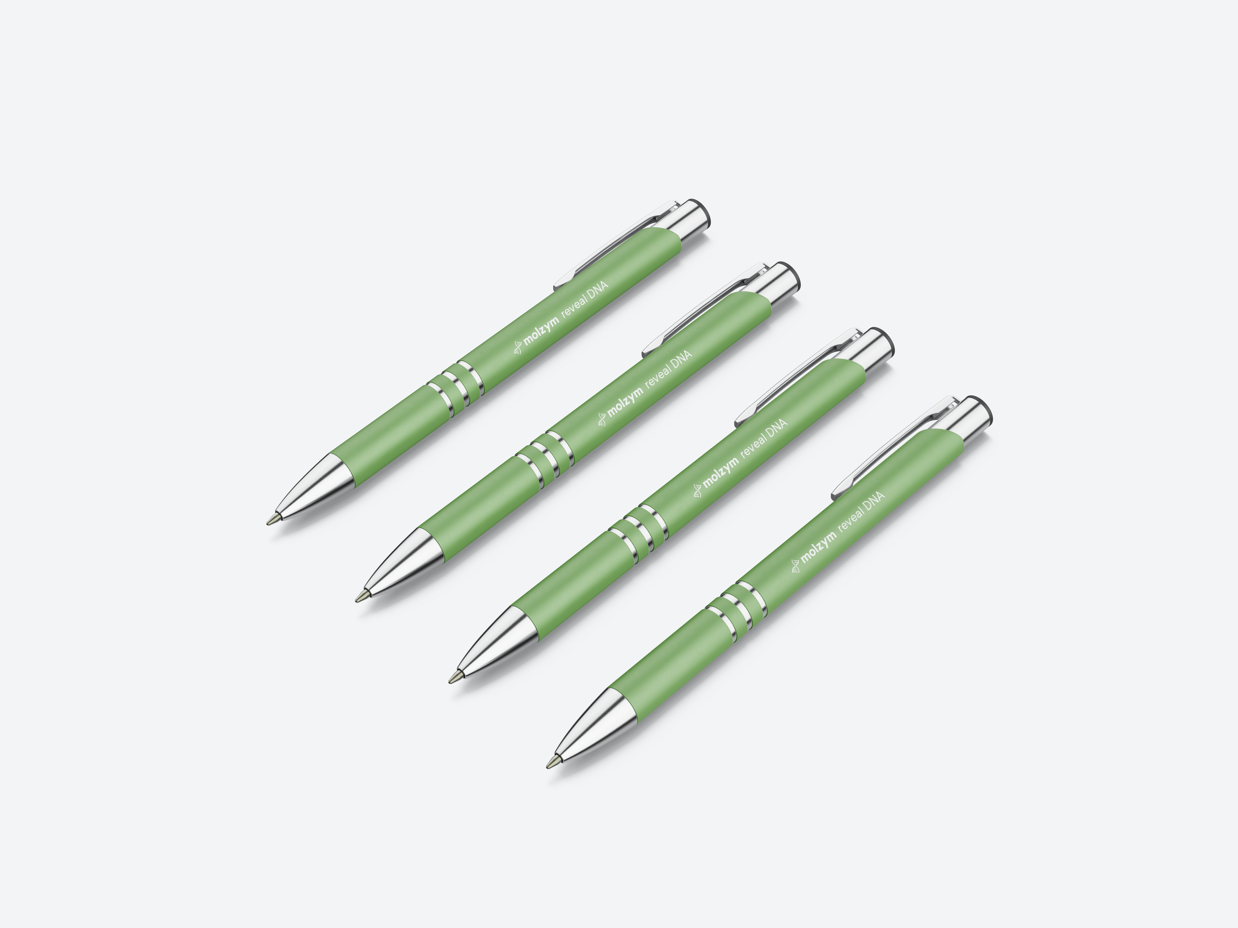
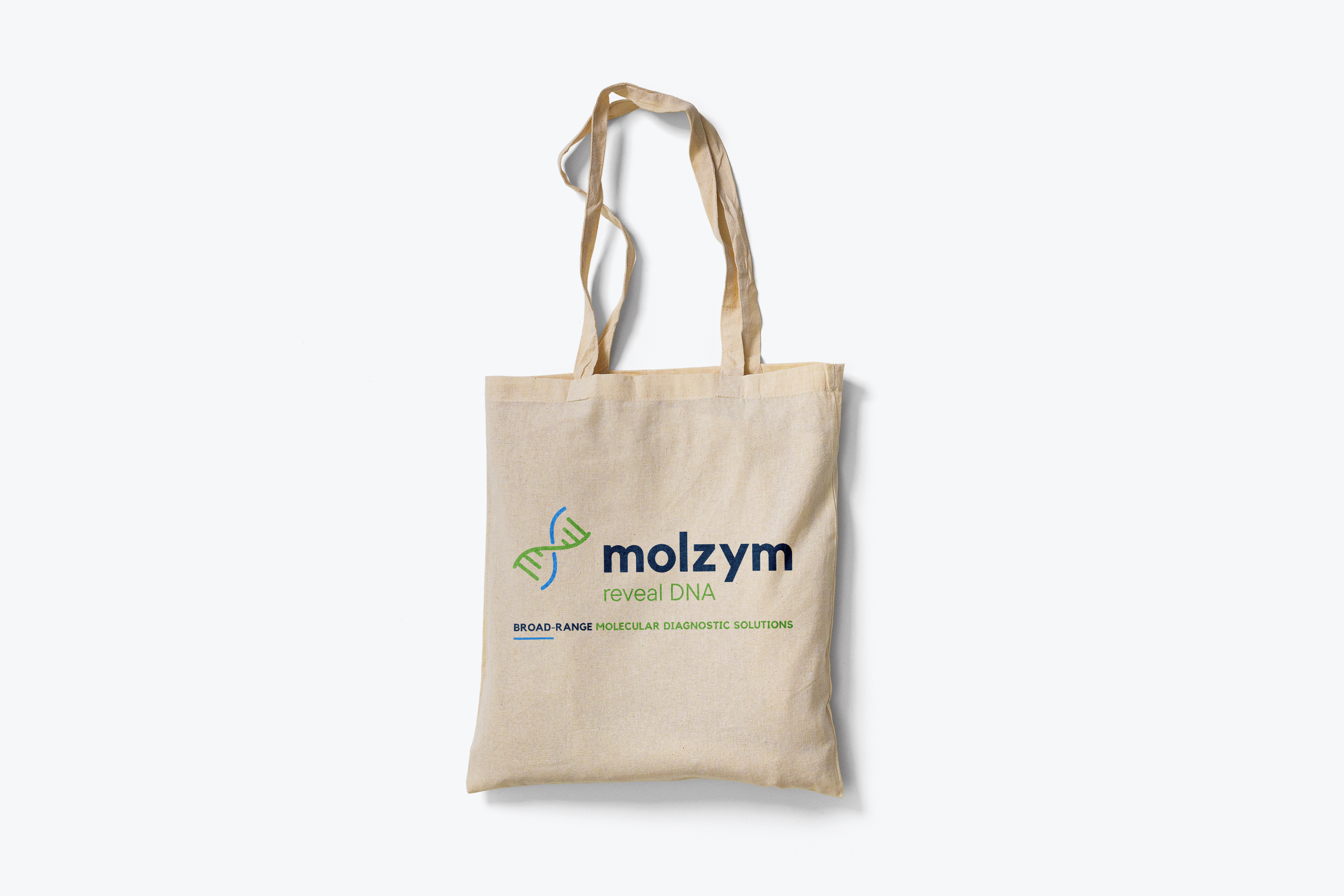
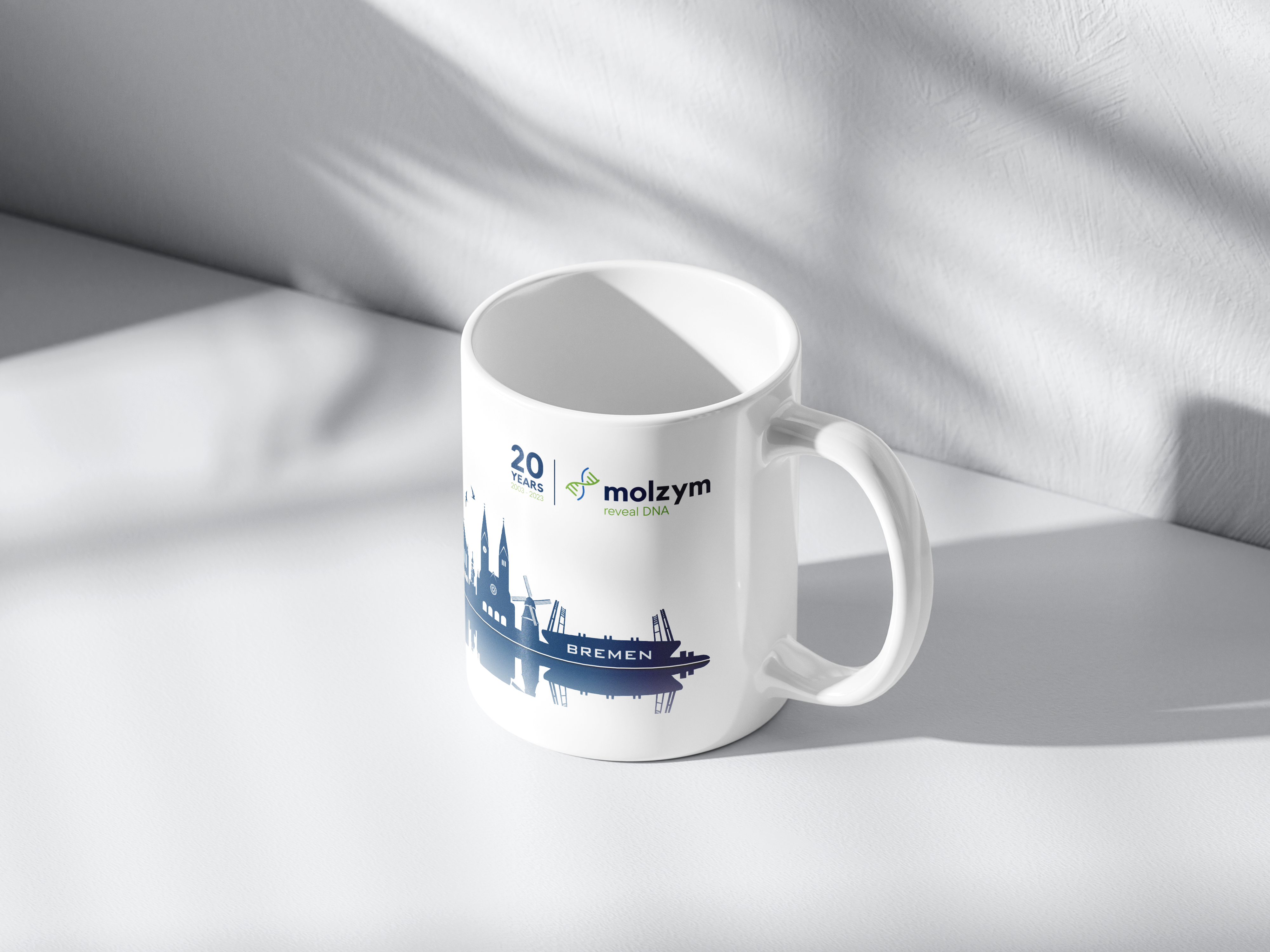
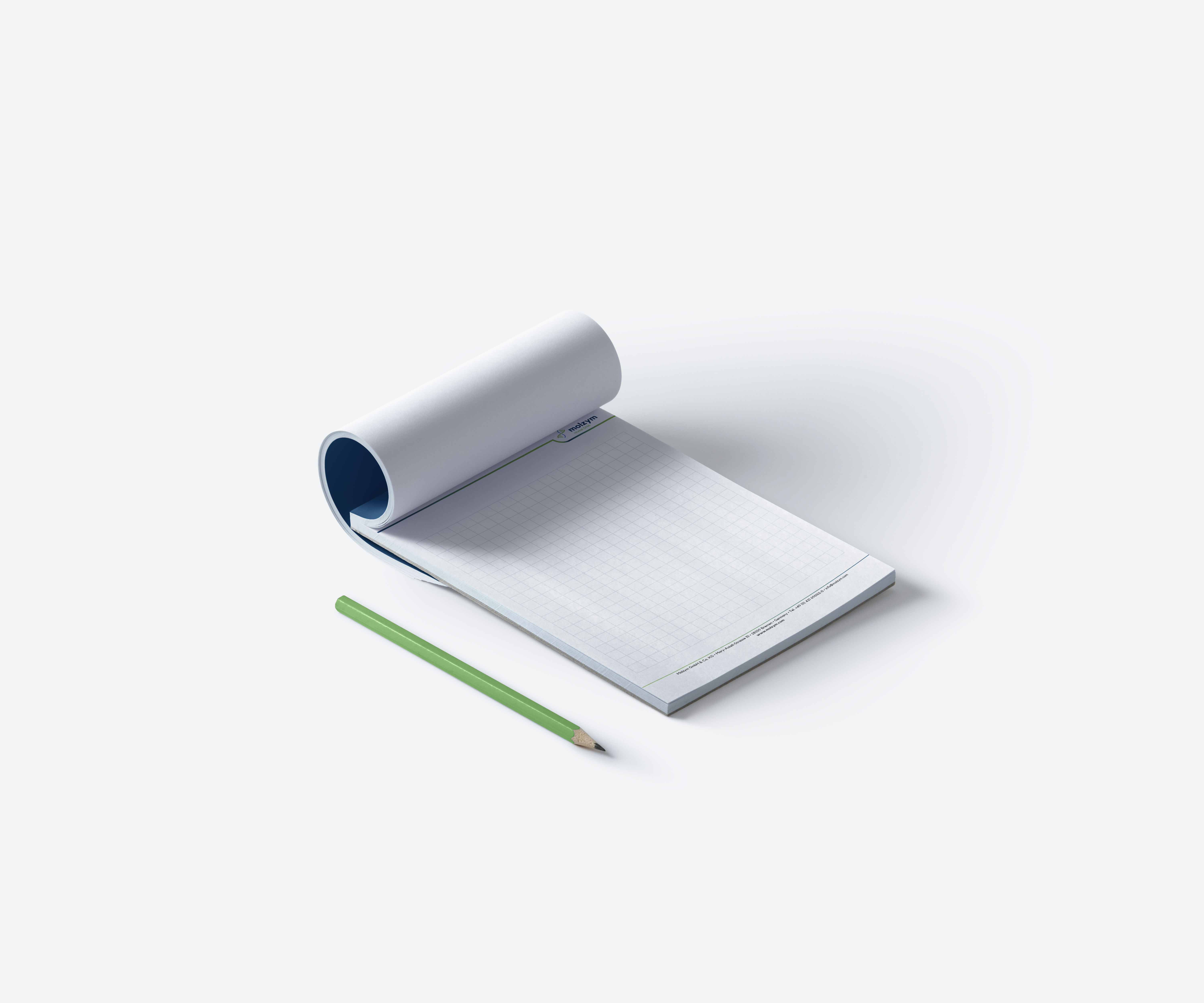
ROLL-UPS & GOODIES
Development of a cohesive brand universe across all physical touchpoints during international congresses.